Statistical charts and diagrams

Contour boxplot

In statistical graphics and scientific visualization, the contour boxplot is an exploratory tool that has been proposed for visualizing ensembles of feature-sets determined by a threshold on some scalar function (e.g. level-sets, isocontours). Analogous to the classical boxplot and considered an expansion of the concepts defining functional boxplot, the descriptive statistics of a contour boxplot are: the envelope of the 50% central region, the median curve and the maximum non-outlying envelope. To construct a contour boxplot, data ordering is the first step. In functional data analysis, each observation is a real function, therefore data ordering is different from the classical boxplot where scalar data are simply ordered from the smallest sample value to the largest. More generally, data depth, gives a center-outward ordering of data points, and thereby provides a mechanism for constructing rank statistics of various kinds of multidimensional data. For instance, functional data examples can be ordered using the method of band depth or a modified band depth. In contour data analysis, each observation is a feature-set (a subset of the domain), and therefore not a function. Thus, the notion of band depth and modified band depth is further extended to accommodate features that can be expressed as sets but not necessarily as functions. Contour band depth allows for ordering feature-set data from the center outwards and, thus, introduces a measure to define functional quantiles and the centrality or outlyingness of an observation. Having the ranks of feature-set data, the contour boxplot is a natural extension of the classical boxplot which in special cases reduces back to the traditional functional boxplot. (Wikipedia).

Contour boxplot
Video thumbnail

Boxplots in SPSS | An Easy Guide | Part 1

Boxplots are extremely helpful in describing data. In these two videos I demonstrate how to generate Boxplots in SPSS and interpret them. I will also show the effect of conventional and extreme outliers on the shape of Boxplots. For more information about normality, please watch this ser

From playlist Boxplots

Video thumbnail

Boxplot - Seaborn

We go over the box plot. I show some hidden gems not in the documentation and explain what the various parts of the box plot are. Associated Github Commit: https://github.com/knathanieltucker/seaborn-weird-parts/commit/b0ffec52f518455141f8af9da326fa02bea5e418 Associated Seaborn Links: ht

From playlist Seaborn: Understanding the Weird Parts

Video thumbnail

Box and whisker plots in Plotly for Python

The box-and-whisker plot, or simply the box plot, is a very useful and commonly used plot. It displays the median, first and third quartile values and possible outliers of a continuous numerical variable. In this video I show you how to construct a box plot, how to change the colors and

From playlist Data viz using Plotly for Python

Video thumbnail

What is the difference between convex and concave

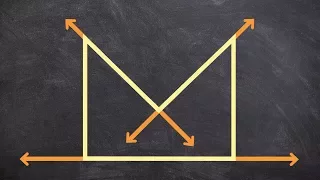
πŸ‘‰ Learn about polygons and how to classify them. A polygon is a plane shape bounded by a finite chain of straight lines. A polygon can be concave or convex and it can also be regular or irregular. A concave polygon is a polygon in which at least one of its interior angles is greater than 1

From playlist Classify Polygons

Video thumbnail

What is a concave polygon

πŸ‘‰ Learn about polygons and how to classify them. A polygon is a plane shape bounded by a finite chain of straight lines. A polygon can be concave or convex and it can also be regular or irregular. A concave polygon is a polygon in which at least one of its interior angles is greater than 1

From playlist Classify Polygons

Video thumbnail

What is the difference between convex and concave polygons

πŸ‘‰ Learn about polygons and how to classify them. A polygon is a plane shape bounded by a finite chain of straight lines. A polygon can be concave or convex and it can also be regular or irregular. A concave polygon is a polygon in which at least one of its interior angles is greater than 1

From playlist Classify Polygons

Video thumbnail

What is the difference between concave and convex polygons

πŸ‘‰ Learn about polygons and how to classify them. A polygon is a plane shape bounded by a finite chain of straight lines. A polygon can be concave or convex and it can also be regular or irregular. A concave polygon is a polygon in which at least one of its interior angles is greater than 1

From playlist Classify Polygons

Video thumbnail

How to Make Boxplots in R

Boxplots provide a visual representation of the distribution of numeric variables that include key values such as the median, 25th and 75th percentiles. Side-by-side boxplots let you break plots out by a second categorical variable to compare differences across groups. #Rprogramming #Data

From playlist Code Clips: R Plots

Video thumbnail

Plots, Outliers, and Justin Timberlake: Data Visualization Part 2: Crash Course Statistics #6

Today we’re going to finish up our unit on data visualization by taking a closer look at how dot plots, box plots, and stem and leaf plots represent data. We’ll also talk about the rules we can use to identify outliers and apply our new data viz skills by taking a closer look at how Justin

From playlist Statistics

Video thumbnail

The easiest way to draw parallel boxplots on computer

There is a website that draws boxplots for you! After you're done, you can copy and paste the boxplot to Word, Excel or where ever you want. A lot of your statistics math assignments at school may need you to draw a boxplot with your computer, to make it look professional. However, it's qu

From playlist Maths B / Methods Course, Grade 11/12, High School, Queensland, Australia.

Video thumbnail

How to Create a Five Number Summary with JASP - Quick but Powerful Measure of Variability (6-11)

The five number summary is a quick but powerful way to assess the shape and variability of a distribution of scores. We begin with an explanation of the five number summary with a small dataset, then learn to compute the five number summary using JASP. Download the Friendly, Free, Flexi

From playlist Discovering Statistics with JASP

Video thumbnail

Sketch a net from a 3D figure

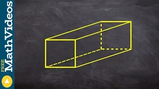
πŸ‘‰ Learn about polygons and how to classify them. A polygon is a plane shape bounded by a finite chain of straight lines. A polygon can be concave or convex and it can also be regular or irregular. A concave polygon is a polygon in which at least one of its interior angles is greater than 1

From playlist Classify Polygons

Video thumbnail

What are four types of polygons

πŸ‘‰ Learn about polygons and how to classify them. A polygon is a plane shape bounded by a finite chain of straight lines. A polygon can be concave or convex and it can also be regular or irregular. A concave polygon is a polygon in which at least one of its interior angles is greater than 1

From playlist Classify Polygons

Video thumbnail

Boxplots & Outliers in SPSS – Identify and Deal with Outliers (4-8)

The boxplot serves up a great deal of information about both the center and spread of the data, allowing us to identify skewness and outliers, in a form that is both easy to interpret and easy to compare to other distributions. It is the graphical equivalent to the five-number summary. All

From playlist WK4 Statistical Graphing - Online Statistics for the Flipped Classroom

Video thumbnail

Cumulative Frequency: Compare Boxplots (Grade 6) - OnMaths GCSE Maths Revision

Topic: Cumulative Frequency: Compare Boxplots Do this paper online for free: https://www.onmaths.com/cumulative-frequency/ Grade: 6 This question appears on calculator and non-calculator higher GCSE papers. Practise and revise with OnMaths. Go to onmaths.com for more resources, like predi

From playlist Cumulative Frequency

Video thumbnail

Boxplots in SPSS | An Easy Guide | Part 2

Boxplots are extremely helpful in describing data. In these two videos I demonstrate how to generate Boxplots in SPSS and interpret them. I will also show the effect of conventional and extreme outliers on the shape of Boxplots. For more information about normality, please watch this ser

From playlist Boxplots

Video thumbnail

The 5-Number Summary and BOXPLOTS (6-10)

The Five-Number Summary gives multiple measures of variability that describe the distribution. A boxplot is the graphic equivalent to a five-number summary. Both show the center and spread of the data, and boxplots can be used to identify skewness and outliers. The five numbers are: Minim

From playlist Depicting Distributions from Boxplots to z-Scores (WK 6 QBA 237)

Related pages

Level-set method | Level set | Interquartile range | Functional boxplot | Median | Statistical graphics | Line integral convolution | Functional data analysis | Descriptive statistics